|
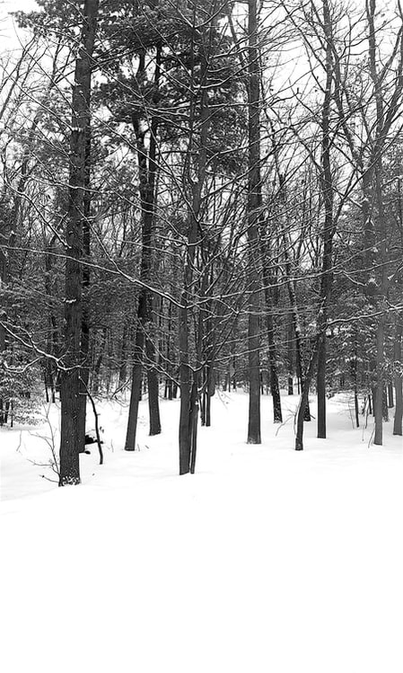
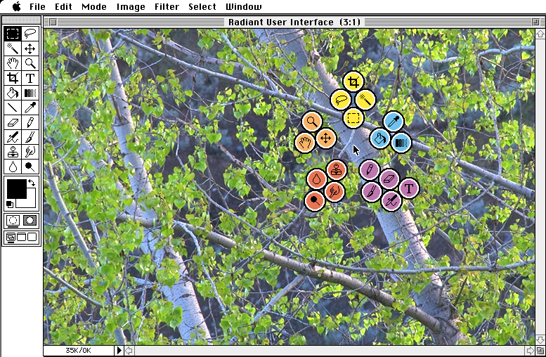
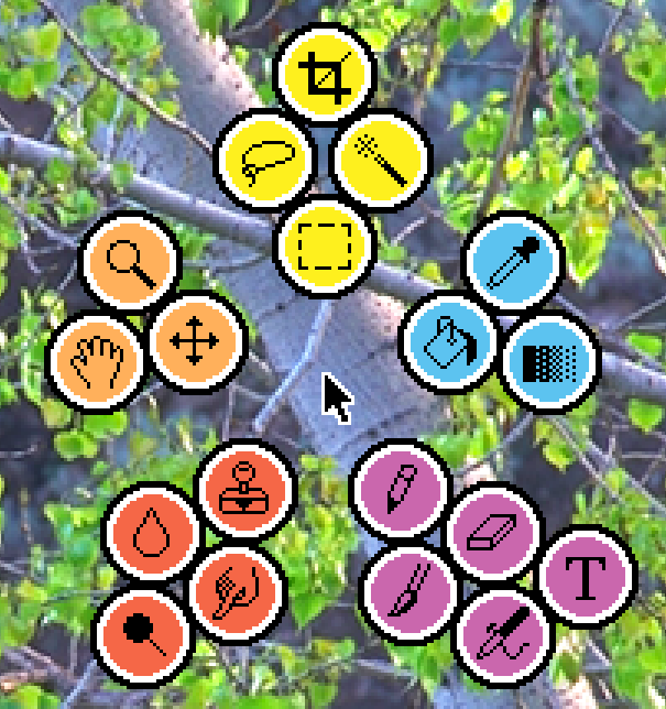
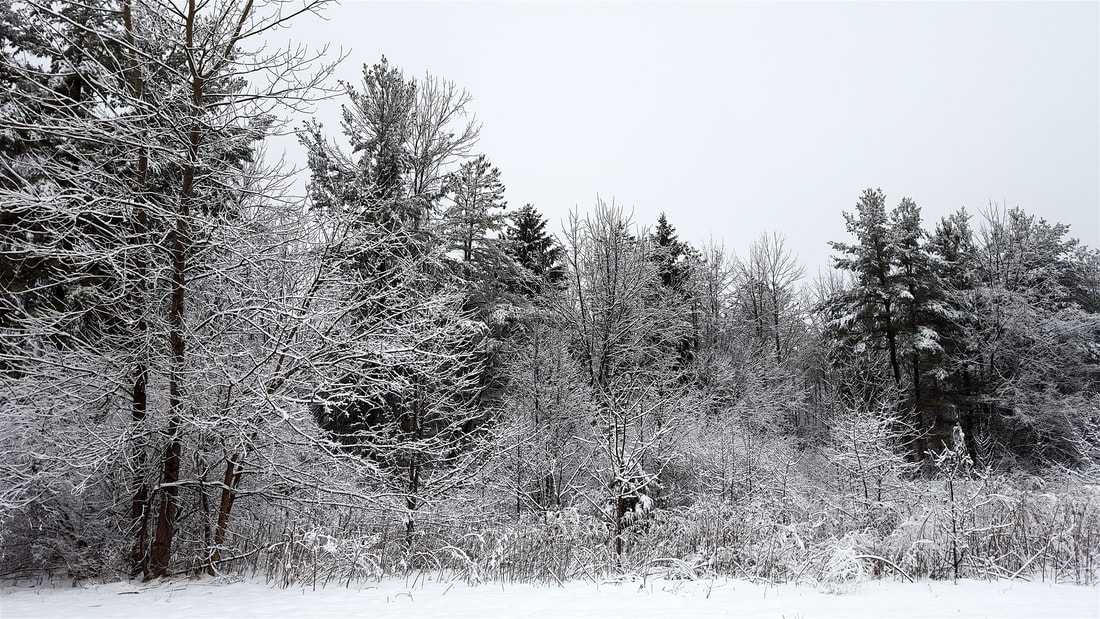
Snow has come to northern Michigan, and I'm reminded of how much I love seeing snow on branches. After all these years, I think I finally figured out why. In 1996 I designed a radiant tool interface for Photoshop. I was tired of mousing over to the toolbar on the left, selecting a new tool, and then mousing back over to my image to do some work. Over and over and over. My idea was to press a key and click, and instantly a set of tools would pop up right around my cursor, wherever it was on the screen. I made a fake screen to illustrate the concept. For all of you Mac users, you can see how long ago this was just by looking at the clunky type used for the menus. For the tool buttons, I used a white outline plus a black outline outside that. It's a technique I use when I need something to stand out against a background but when the background could be anything. The white line stands out against dark areas, and the black line stands out against light areas. Easy and effective. I realized today that's what's happening with those beautiful snowy branches. Each branch is white on the top and black on the bottom. Instead of all the trees blending together, every branch now stands out against every other branch. The amount of detail the snow reveals is staggering, and my eyes love it. I'll offer up a picture I took a couple years ago. The more I look at snowy branches, the more I want to look. Beautiful!
3 Comments
David Andora
12/29/2017 08:24:21 am
Firstly, I have never before seen this interface enhancement you created, and want to use it right now!
Reply
Scott
1/5/2018 06:53:28 am
Context menus (like the now-typical right-click menus) are similar and began to show up after I mocked this up, but they aren't the same thing.
Reply
Leave a Reply. |
Hi, I'm Scott MoehringI'm a designer, teacher, writer, inventor, hockey player, gamer, and lifelong learner. I like to make cool stuff and share it with curious people. Archives
January 2021
Categories |


 RSS Feed