UI DESIGN
I like thinking of ways to make software easier or more fun to use. I've created a few interface tools, a few PDF systems with self-contained navigation, and a few websites. I have also been on a couple of beta testing teams, including a department project management tool built in Filemaker, another built on top of an online Digital Asset Management base, and for Adobe InDesign back in 1999 when it was still codenamed K2 and Sherpa. Human-computer Interaction and UX/UI are the only Master's degree I had ever seriously considered.
Radiant GUI for accessing Adobe Photoshop tools (1996)
I designed a way to access the Photoshop tools without having to move your mouse all the way over to the tools menu on the side. This idea came from learning about mind maps, which radiate from the center of the page. I imagined the user would hold a modifier key and click, which would instantly bring up the tools centered around their current cursor position. I grouped the tools into chunks and colored them for faster recognition and access. I also made the outlines of the icons a combination of a black and a white circle. This ensured they would stand out against any background, light or dark.
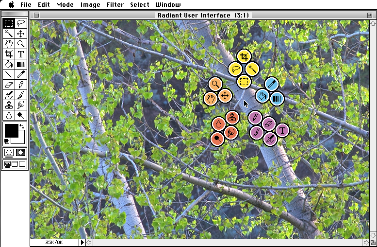
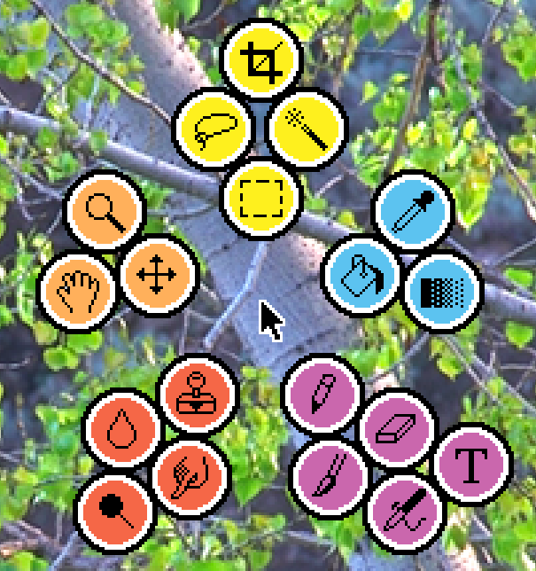
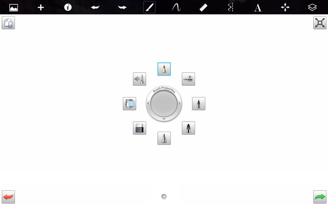
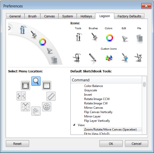
Unfortunately, I didn't know anyone at Adobe (yet), so I never submitted this idea. I wrote more about it here. I'm still proud of the idea, because this approach is currently used in modern graphics software. For example, here's an Autodesk Sketchbook popup menu. You can also choose which tools appear, and in which locations.
|
|
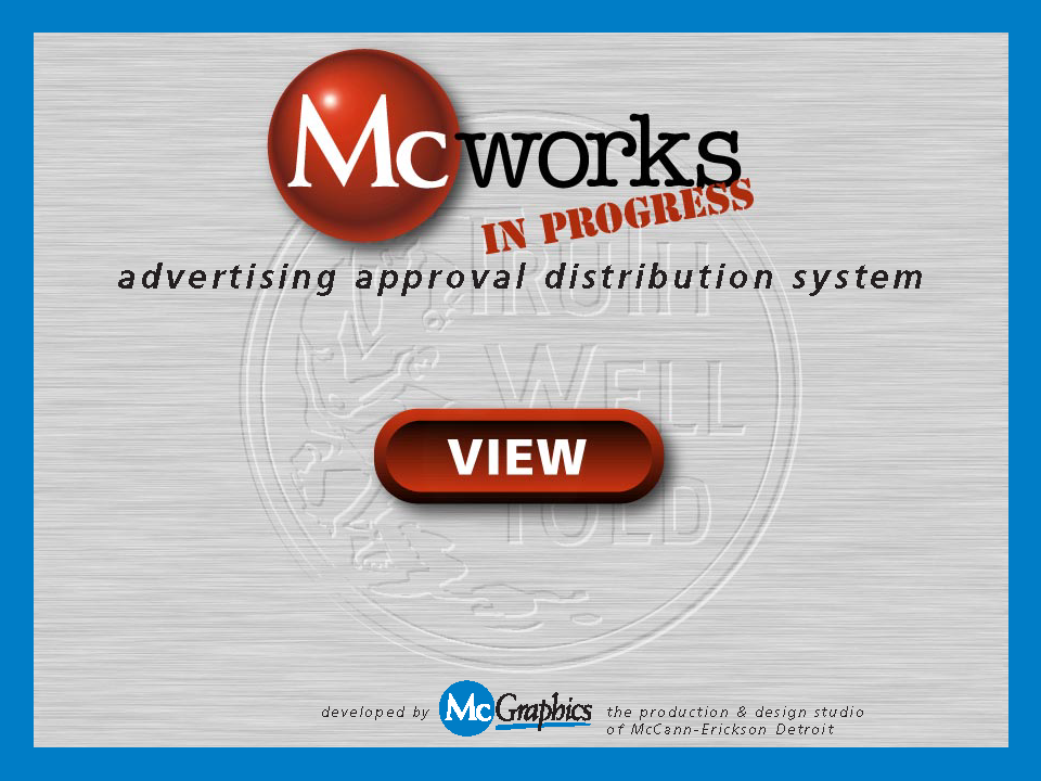
General Motors PDF-based full-text searchable advertising system (1998)
I discovered a few lesser-used features of Acrobat and PDF files, and used them to develop a full-text searchable system for our General Motors advertising. Advertising files were created by our studio, sent to teams for virtual approval, distributed to regions and brand managers once approved, and then stored in our searchable archive. Pretty common now, but this was ahead of the curve in 1998, and I received a GM Alpha award.
|

|

|
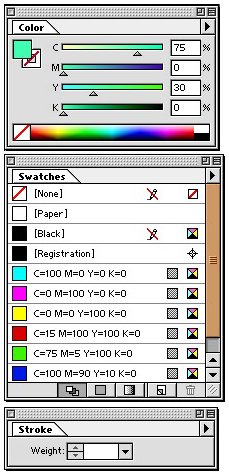
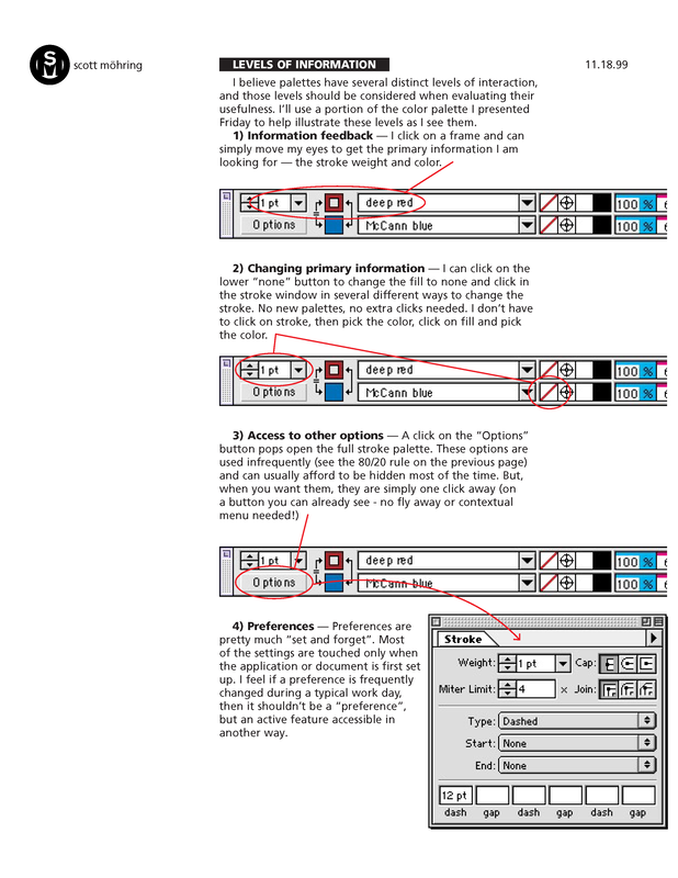
Small-space tool palette for Adobe InDesign (1999)
When I was at McCann Erickson, I had the opportunity to be on the beta team for a new product, Adobe InDesign. As part of that very cool process, I offered up a redesign of the tool menus. It includes the features of the standard InDesign color, swatch, and stroke palettes, but it only uses a fraction of the screen real estate (less than 1/3 the pixels). I think it also provides better access to information and there are even a few features not found in the full menus.
My design is on top, and the official InDesign menu design at that time is on the bottom.
My design is on top, and the official InDesign menu design at that time is on the bottom.

I was fortunate to get to fly to Seattle to spend a few days with the Adobe team. I presented some ways we expected to use their new InDesign software, and then followed up with an in-depth summary of feedback for the current iteration that was still in development.
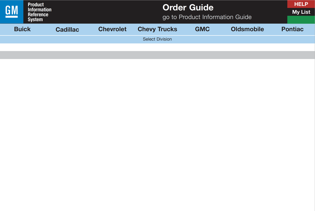
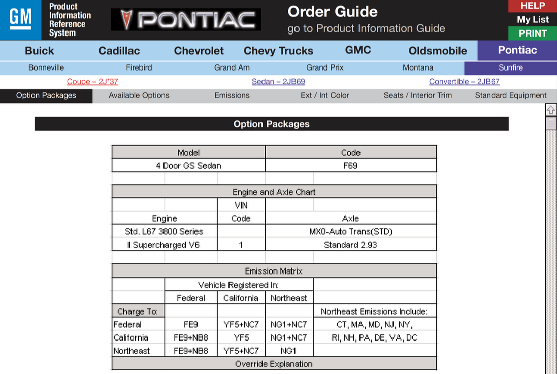
GM PIRS Product Information Reference System kiosk prototype (1999)
I like using links in PDF files to quickly mock up an interactive website. This really unattractive design was to test the functionality of a stacked website navigation idea I had. This was for a GM product guide that was still being stored on paper in binders. The concept was to be able to navigate down through a series of options, but to always keep the higher level options available.
In the example below, I have selected Pontiac > Sunfire > Options Packages. Even though I'm now three levels deep, with a single click I can still switch to any of the other Makes, or any of the other Pontiac Models. My successful goal was to be able get to any other page on the site with four clicks or less. It was a super fast, compact, and visual way to navigate a huge set of pages.
In the example below, I have selected Pontiac > Sunfire > Options Packages. Even though I'm now three levels deep, with a single click I can still switch to any of the other Makes, or any of the other Pontiac Models. My successful goal was to be able get to any other page on the site with four clicks or less. It was a super fast, compact, and visual way to navigate a huge set of pages.
|
|
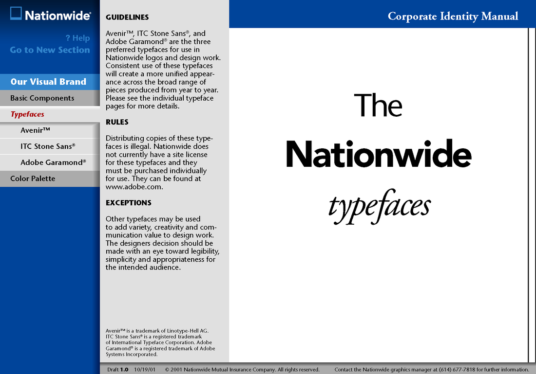
Nationwide PDF brand standards manual with clickable navigation (2001)
This was an interactive PDF built in Adobe Indesign. The links were all included as part of the master file, and automatically exported ready-to-go every time we made an updated PDF. The main advantage of using a PDF was that it was portable. We burned the file onto CDs, and anyone accessing them could click through the 100+ pages like it was a website. Clicking on the buttons would instantly load a new page (no wait times!), and the three-level navigation sidebar would change to reflect your new location. Because everything lined up exactly from page to page, only the content in the sections appeared to change.

|
|
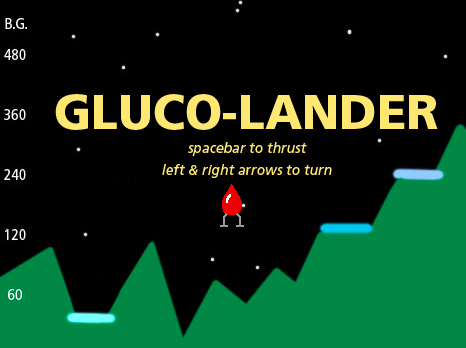
Gluco-lander (2007)
My son Andrew and I wanted to make a game that taught a little about diabetes, but was mostly just fun to play. Gluco-lander is a game based on the classic Lunar Lander, except that it uses blood sugar management to control and land the ship. There are multiple levels, and even two mini-games that start if your blood sugar is too high or too low.
We built it in Scratch, the programming language for kids developed by MIT. We were happy because we succeeded in making a diabetes video game that was actually fun to play!
We built it in Scratch, the programming language for kids developed by MIT. We were happy because we succeeded in making a diabetes video game that was actually fun to play!
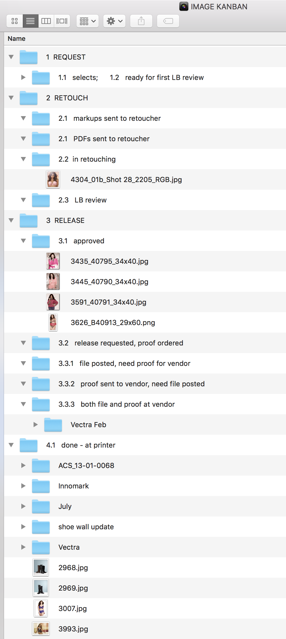
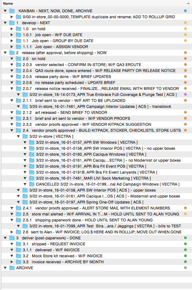
Mac folder-based Kanban project management system (2012, 2014)
I used this system to manage the photo-retouching process at Lane Bryant. After many years of trying different software solutions, only to have them become unsupported or no longer allowed, I developed a Kanban system based on file folders on my Mac. It was dead simple, and immune to software obsolescence. Each step had a numbered folder (to keep them in sequence), and each photo had a low-res JPG named with the image number. I just moved the photo JPG between the folders to keep track of the status of each.
I used it for years, and the photo coordinators that followed me taught it to their successors as well. I took that as the best compliment I could have ever received. I went on to adapt it for my production jobs as well. The only thing I changed was that each job was now a folder, with its due date, job number, name, and vendor. Otherwise, it was just the same dead-simple drag-and-drop to update the job status. Even with tracking the hundreds of printing and shipping jobs I was managing every year, it never failed me.
I used it for years, and the photo coordinators that followed me taught it to their successors as well. I took that as the best compliment I could have ever received. I went on to adapt it for my production jobs as well. The only thing I changed was that each job was now a folder, with its due date, job number, name, and vendor. Otherwise, it was just the same dead-simple drag-and-drop to update the job status. Even with tracking the hundreds of printing and shipping jobs I was managing every year, it never failed me.
|
|
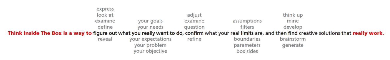
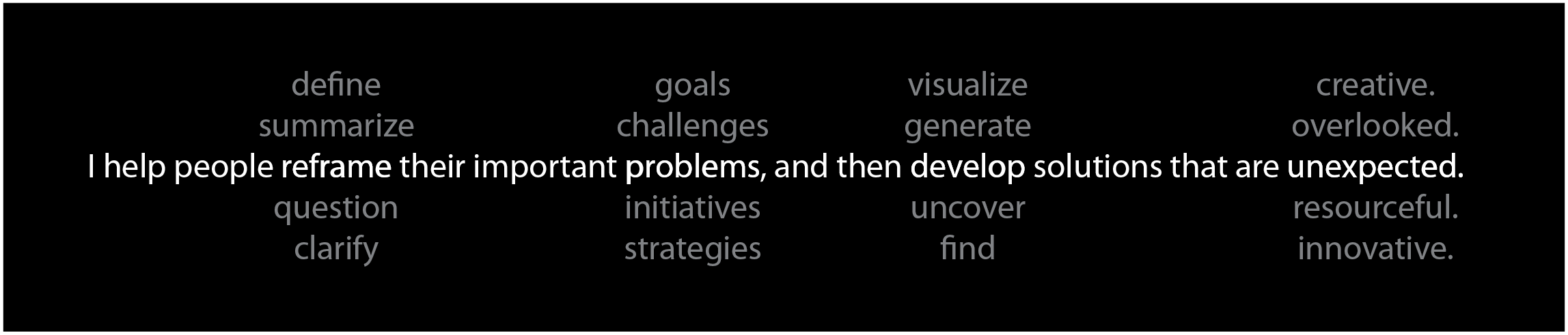
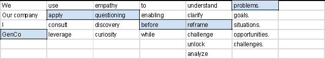
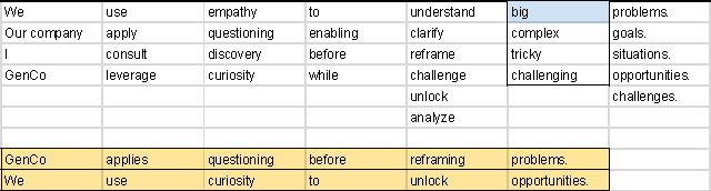
Tyrannthesaurus Rex (2019 concept)
This is an idea for an app that can help you quickly develop and capture variations of headlines, taglines, problem statements, slogans, acronyms, and other short phrases.
It's an expansion on a graphic technique I used a couple times to communicate a statement that had a thesaurus-like underpinning. The graphic is a visual representation of my thought process as I write. I thought it would be a handy writing tool if it helped you quickly find options and capture them for evaluation later.
It's an expansion on a graphic technique I used a couple times to communicate a statement that had a thesaurus-like underpinning. The graphic is a visual representation of my thought process as I write. I thought it would be a handy writing tool if it helped you quickly find options and capture them for evaluation later.
Here's how I envision it working:
Step 1 - Type your phrase. The individual words are put in separate fields automatically.
Step 1 - Type your phrase. The individual words are put in separate fields automatically.

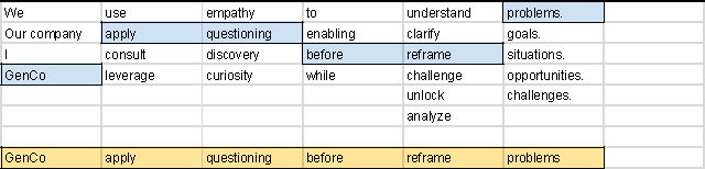
Step 2 - Alternatives appear for each word. See Visuwords™, which uses Princeton University’s WordNet, an opensource database.
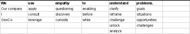
Step 3 - click to select a sequence of words
Step 4 - click SAVE A VERSION to save that version
Step 5 - software applies grammar corrections to saved sentence
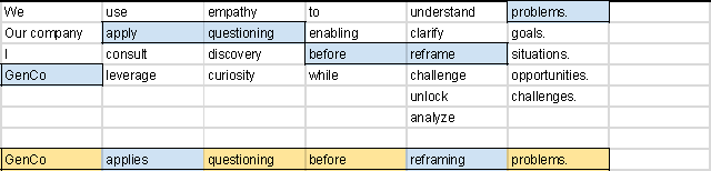
Step 6 - repeat with another set of words
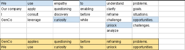
Step 7 - change or add a word any time to get different options
Step 8 - repeat until you have the inspiration you need for your phrase. The process should be fast.
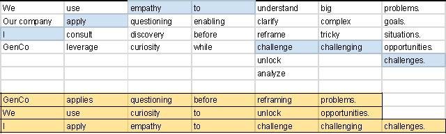
I think it's a great idea (meaning I would love to have it because I would use it all the time). Maybe I can find a programmer who can help me develop it?